
The Adobe-Pantone Split and What it Means for Printers
January 26, 2022 by Marco Roos

2022 has started with what is possibly the biggest news in the Graphics Industry in years: “Adobe to drop support for Pantone libraries in March of 2022”! Needless to say, this will have consequences for anyone involved in graphic design and printing services. While the announcement came as a surprise for most, there have certainly been warning signs. To those that license Pantone Libraries, or develop tools that utilize Pantone libraries, this may have even been a long time coming.
The companies’ official statements are putting a lot of positive spin on the announcement, and promise that while Adobe and Pantone’s marriage is over, they will continue to collaborate to give the user the best experience possible. However, many sources close to the companies are reporting a different story. Allegedly, Adobe was no longer willing to pay for the license fees Pantone is charging. Over the past few years, Pantone has been focusing on PantoneLIVE and moved its business more and more into the direction of a subscription-based service. Pantone also developed an extension that can be used with Adobe software, which gives access to the online Pantone libraries on PantoneLIVE. This however requires the user to have an active Pantone subscription on top of paying for the Adobe Creative Cloud. It looks like Pantone is pushing users towards that model and Adobe was not willing to facilitate by including a Pantone license in their subscription fees, like it used to do in the past.
Pantone became wildly popular in the era of offset and screen printing and is still popular amongst designers. However, for the modern print service provider, it is an entirely different story: printing Pantone colors has become increasingly difficult with the digitization of printing technologies. So the question is: what happens now? Will Pantone’s move to a separate, user-purchased subscription model pay off? Is the Pantone system still the best solution for working with specific brand colors? To answer this, let’s dive a little deeper into the technology and science behind printing accurate colors!
History
Believe it or not, Pantone started as an ink formulation company - mixing pigments into specific colors and naming them. This provided a huge amount of value as it made it easy for designers and printers to talk about color. Instead of referencing ink recipes and mixing percentages, people now could simply name the color they wanted - like ordering off a menu at a restaurant. Today’s Pantone books contain more than 1300 different colors, of which approximately 15 are named; the rest are given specific numbers. All numbered colors are made by mixing the 15 named ink colors using recipes that can be found in the Pantone books, right underneath the colored swatches.
This system was revolutionary, especially back in the day when larger offset printing companies had entire collections of ink cans containing the named ink colors. That said, this simplicity did come with costs. Mixing the colors was done first by hand using scales, and later with fully automated and expensive ink mixing systems. And, it always required a fifth ink channel (or more, depending on the amount of Pantone colors used) to be added to the printing process. When offset printing became more standardized through ISO, SWOP, and EuroScale standardizations, Pantone also started offering Pantone Process books. These books showed the Pantone colors after they were converted to CMYK colors. Printing them like this would result in less vibrancy but would no longer require an extra ink channel to be used.

Pantone and Digital Printing
Digital printing became a challenge for Pantone because users were no longer able to add additional colors to their standard CMYK process colors. The industry started to call Pantone colors ‘spot colors’ and CMYK colors ‘process colors’. In digital printing, the process colors are not standardized, like they are in offset and screen printing. This means that every manufacturer is using a different color of cyan, magenta, yellow and black. Also, the wide variety of materials makes these process colors look different on every material, making it impossible for Pantone to give out recipes for their color books. This is when they started to license their libraries with the color definitions to the printer manufacturers and RIP software manufacturers. The libraries are encrypted and contain the mathematical values for each of the Pantone colors.
RIP software is built to recognize the named spot color in a design file and then looks up the mathematical color value for that spot color in the library provided by Pantone. These mathematical values are then processed through an ICC profile to calculate the exact CMYK mix needed to match the color as closely as possible. This can be a big challenge, since most CMYK printers are not able to create all Pantone colors from the swatch books, resulting in what we call “difficult colors”. Every digital printer knows how difficult (or even impossible!) it can be to print Pantone Orange or Pantone Reflex Blue. And even when the ink is correct, we are facing the challenge that these colors will look differently on each different material. That is why for most printing companies Pantone is no longer such a blessing as it used to be since it often leads to a discussion with agencies and brand owners who find it hard to believe that expensive digital printing equipment and specialized software are not able to print something as “simple as a Pantone color”.
The Future
Pantone for the large format printing industry is more of a communication system than anything else. While Pantone’s clear naming convention started as the solution to seemingly any color problem, the complexity of digital printing has heavily eroded its value. Complicating things further is the nearly annual updates to Pantone’s libraries and books, incorporating slight color changes and definitions. In our experience, it is safe to say that more than 75% of all print and sign companies are using Pantone swatch books that are outdated. Therefore, they do not match the libraries in their Adobe software, let alone the RIP software libraries, which aren’t as frequently updated. The reality for most printing companies is that not using Pantone colors is making life a lot easier. Unfortunately, that is not always the case for print buyers and designers, who still have a false sense of security when using Pantone colors.
After March 2022 you will have to decide whether you still want to use the Pantone libraries in your Adobe software and get a subscription to the Pantone Live ecosystem to keep those libraries available in your Adobe suite of applications.
Workarounds
At the end of the day, the chances that your customer is using a different version of the Pantone swatch book than you are (and thus are looking at different colors), or that your printer and material combination are unable to reproduce the difficult colors exactly as shown in the swatch books, are high. In case of doubt tell the customer that making a test print is the best way to reach an agreement on what the color is going to be, no matter what it is called!
Are there any workarounds possible? Sure! For starters, you might find value in a piece of additional software called Pantone Color Manager. While its libraries have not been updated since 2020 (and Adobe will only support it till the end of 2022), you may find that you are eligible for a free subscription depending on which spectro device you use. We recommend reaching out to Pantone Customer Support for more info.
Secondly, If you receive PDF files from customers which contain Pantone colors, your RIP software will still detect these and replace them with the built-in libraries. Also, in Adobe software you can still create your own spot colors like you do for contour cutting and name them after the Pantone color you would like to use. Just make sure you are using an up-to-date version of the RIP software and that the spot color replacement features are switched on. Remember though that when you are using an incorrect printer profile, this entire mechanism will not work. Always use correct printer profiles in order to get reproducible results!
Luckily, here at ColorBase, we have built the world’s largest library of printer profiles and made them available for free through our Profile Search tool. We are adding new profiles all the time, so make sure you check it regularly!
What do you think about the Pantone-Adobe split? Will it change your workflow? Will you be purchasing a Pantone subscription? Connect with us on LinkedIn, Facebook, Twitter, or Instagram, and let us know!

Marco is the founder of Color Concepts which started as a services business in the digital printing industry. Marco was active as a trainer and consultant in color management in more than 87 countries, but he soon realized that the future is in data and connected ecosystems and started the development of ColorBase. Today Marco’s role is that of a visionary leader and strategist.
Read more articles
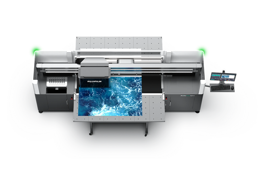
Announcing the Fujifilm Acuity Prime Hybrid Launching Materials Program – ColorBase is proud to play a part!
The Launching Materials Program – What Is It? Fujifilm and ColorBase are collaborating on the Fujifilm Acuity Prime Hybrid…
Dissecting Delta E and the Mathematical Difference Between Colors
When discussing colors, we often don’t need to see two hues or color family types next to each other…
ColorBase Announces Participation in Color Quality Conference ’24
Capelle aan den IJssel, The Netherlands – 22 January, 2024 ColorBase is thrilled to announce its participation in the…