
How To Create Named Spot Colors in Adobe (and Your RIP)
May 3, 2023 by Shelby Sapusek

Before learning how to create named spot colors, it’s important to understand what they are and how they are used.
Just a few weeks ago, my business partner Jim Raffel and I presented “How Important Is Brand Color?” at the ISA International Sign Expo in Las Vegas. Many print facilities are tasked with achieving accurate brand colors for their clients and it can be one of the more challenging aspects in printing.
Why Do We Care About Brand Colors?
Brand colors encompass the identity of companies, organizations and products. They are:
- Key components of an entity’s visual identity
- Designations of a personality or style
- Used in logos, graphics and signage
- Catalysts for recognition via color memory
Some companies cherish their brand colors so much that they actually copyright them so that no one can legally duplicate them.
When people have trouble understanding the importance of brand colors, I mention Coca-Cola. I ask them if they can visualize the company’s red. When they say that they can, I explain to them that Coca-Cola cares that the red looks the same on their paper labels, aluminum cans, cardboard cartons and billboards.

Spot Colors = Brand Colors
Since so many brand colors are copyrighted, it makes sense that they are created with special and unique recipes as spot colors. These are colors created with a specific pre-mixed ink; usually based on the Pantone standardized matching system or PMS.
Since spot colors aren’t created using a traditional CMYK (cyan, magenta, yellow and black) or RGB (red, green, blue) recipe, they need to go through a different process for printing. They need to be set up differently – and very specifically – in the design software and the RIP software.
Defining Spot Colors
Spot colors are defined by the L*a*b* color space. Imagine this color space as a three-dimensional globe with the L axis running from the top to the bottom and the a axis and b axis running horizontally through it.

The L axis represents the gray balance of the color space with a higher L number signifying a whiter, brighter color and a lower L number signifying a blacker, darker color. The a axis represents the red to green spectrum with a higher a number trending more towards red and a lower a number trending more towards green. On the b axis, yellow and blue are assessed by a higher b number trending more towards yellow and a lower b number trending more towards blue.
How To Create Spot Colors In Your Software And RIP
Once you have an understanding of spot colors and how they are used, you need to know how to implement them into your color management strategy.
First as an Adobe user, you will want to create the spot color in Illustrator or InDesign. Avoid using Photoshop for spot color creation. Photoshop is best used for image editing and not color management.
Open the Swatch library and create a new swatch. There are four options to note:
- Name the swatch carefully. Note any capitalization, spaces and punctuation.
- Set Color Type to Spot.
- Set Color Mode to Lab. (You may have to scroll up on the pull-down window to find this option.)
- Enter the L*a*b* values for the spot color you wish to create.

To carry the spot color’s correct values over into the RIP, the swatch name must be exactly the same in your Adobe software as in your RIP or the replacement will not work correctly. If the two names are the same, the RIP will recognize the values for L*a*b* that you input in the Adobe software and each time that color name appears, that is the color it will create.
After you have added the swatch color to your Adobe library, you need to create the replacement formula for the spot color in your RIP. Every RIP handles spot color replacement a little differently; but the concept is the same. The following is an example of how to configure the Onyx RIP.
Onyx has a feature where you can print out a Color Matching Table. You go to Setup, then PostScript and choose Color Matching Table. In this window, you can enter the values for the color you are trying to match. Then you can choose your percentage steps and size of the swatches that you want to view and/or measure.

Once you have chosen the best match for your spot color, you need to tell Onyx how to replace it. The first step is to check the Use Spot Color Replacement Table box in Quick Set.
Spot color replacement is achieved in the Color Matching Table feature. You can find it by going to Setup and then RIP Configuration. When you have opened the Color Matching Table menu, select the tab labeled Print Mode Defined Colors.

In that tab, click the Select Mode button and you will be prompted to enter the following information: Printer, Media Group, Media Name, and Print Mode.

Once you have entered that information, click OK. Then click the Add button. The Add Device Color window will open. This is where you can enter the precise name of the spot color you are trying to match as well as your chosen values from your best match via the Color Matching Table.

Now whenever a color comes through with that name, Onyx will know to print those specific values.
What If You Don’t Know The L*a*b* Values Of A Spot Color?
The previous procedure will work if your client provides the L*a*b* values of the spot (or brand) color they are asking you to print. But what if they only have a color swatch as an example?

Using a spectrophotometer, you can measure a swatch of color to find an acceptable match to a Pantone color or the L*a*b* value. In many RIPs, you input the desired values and then print out blocks of digital samples of the color for comparison. Again by using the spectrophotometer, you can measure the samples to get to the closest option using a Delta E comparison.
Misunderstood – But Powerful
Spot colors solve specific printing problems but also create unique challenges. The spot color replacement method is said to be one of the most misunderstood – yet powerful – functionalities in both design and RIP software.
Once you have mastered different techniques in spot color replacement, you will be able to achieve brand colors more consistently, accurately and reliably.
Note: If you weren’t at ISA or otherwise missed our presentation on brand colors, you can listen to it on the ISA website.

Shelby Sapusek started in the newspaper industry; working in graphic design and pre-press. She’s been working in the wide-format print industry since 2011. Today, she travels to printing facilities to work with graphic designers, end users and manufacturers to improve their color management skills.
Title: Color Management Consultant, CMO of ColorCasters, LLC
Read more articles
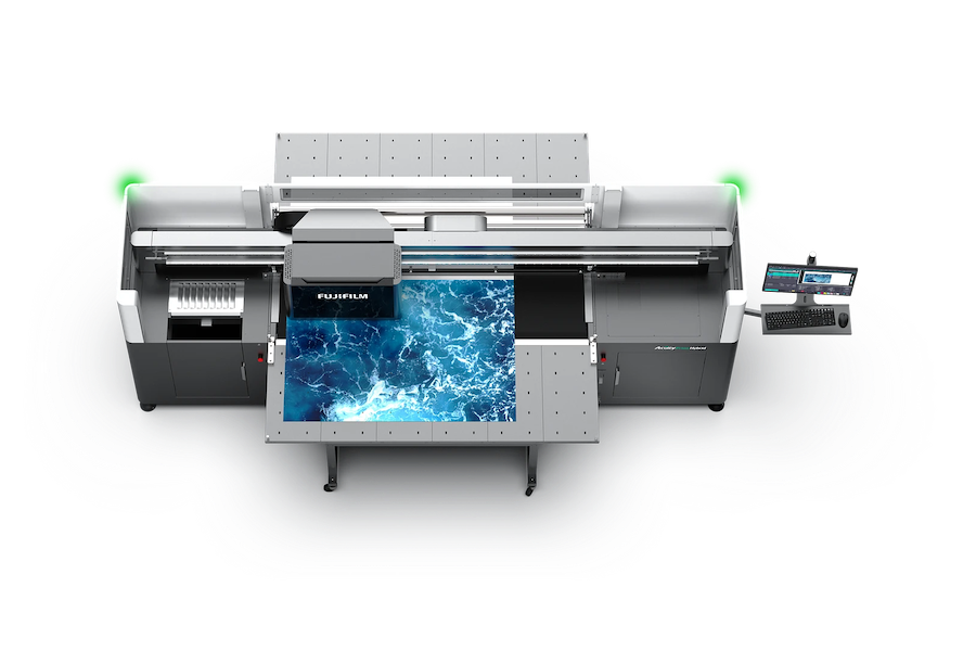
Announcing the Fujifilm Acuity Prime Hybrid Launching Materials Program – ColorBase is proud to play a part!
The Launching Materials Program – What Is It? Fujifilm and ColorBase are collaborating on the Fujifilm Acuity Prime Hybrid…
Dissecting Delta E and the Mathematical Difference Between Colors
When discussing colors, we often don’t need to see two hues or color family types next to each other…
ColorBase Announces Participation in Color Quality Conference ’24
Capelle aan den IJssel, The Netherlands – 22 January, 2024 ColorBase is thrilled to announce its participation in the…