
How To Set Up Ideal Color Management Settings For Adobe Software
March 17, 2022 by Shelby Sapusek

One of the keys to a good color management strategy is choosing the ideal settings for your RGB and CMYK working spaces in Adobe. If you choose wisely, you can open up your color gamut and achieve better consistency between print jobs.
The Defaults Upon Download
When you first download Adobe Illustrator, Photoshop and InDesign, you will want to check your color management settings. You do this by clicking on Edit in the main menu and choosing Color Settings. In all three software programs, this will open a window that shows you the default working space and color management policies.
The default for RGB is sRGB and CMYK is set to U.S. Web Coated SWOP. The problem with these defaults is that they are old and the color gamut for both spaces is small. By using these defaults, you are limiting your working color. These working spaces work well for online use but not as well for digital printing.

The Gamut Game
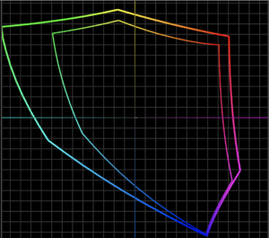
sRGB vs Adobe RGB 1998 - credit to Printing United Alliance
A gamut is the range of color a device can capture (such as a camera) or reproduce (such as a printer). Every device has a different gamut and colors that are outside its gamut and can’t be captured or reproduced.
To set yourself up for success, you want to start out with an RGB and CMYK working space in the Adobe software products that have larger color gamuts. Color management professionals usually recommend changing the RGB working space to Adobe RGB 1998 and the CMYK working space to Coated GRACol 2006 (ISO 12647-2:2004).
These working space choices give you a bigger color gamut. For a visual assessment, you can use a profile viewer to compare gamuts. For instance, if you compared the default RGB working space of sRGB to Adobe RGB 1998, you can clearly see that the gamut of Adobe RGB 1998 is larger.
To Honor Or Not: The Question Of Embedded Profiles
Another color management setting to consider is whether or not to preserve (honor) embedded profiles. There are arguments for both sides for this setting.
Many in the print industry deal with client provided files; not just files that originate at their facility. When a client submits a file to a print facility, it’s important to understand that they might have created the file in the default working spaces of sRGB or U.S. Coated SWOP. While it’s recommended to use the working spaces that allow for a larger color gamut, changing the setting might not produce the file in a way the client expected.
Overall, color management is about variables and deciding which ones to choose. If working with a client’s provided file, it’s generally recommended to honor or preserve the embedded profiles. You can also check the boxes for “Ask When Opening” so that each time you open or import a file you can choose whether to preserve the embedded profile on a case by case basis.

The Intent To Render
The Adobe products allow you to select a rendering intent in your color management settings. Rendering intents tell the software what to do with a color in the file that lands outside a device’s color gamut.
In Photoshop, the intent option is on the righthand side of the Color Settings window. In InDesign, the option is at the bottom of the window. In Illustrator, you’ll need to click the More Options button to see rendering intents.
The default is set to “Relative Colormetric,” which is usually recommended. If you choose this option, it’s also recommended to check the “Black Point Compensation” box.
An exception to this choice would be if your facility only printed photographic images and no specific brand or spot colors. Photographic images are best reproduced with the “Perceptual” rendering intent.
While all of these settings are recommended, remember that there are exceptions to every color management rule. But you need to understand the rules – or settings in this case - before you break them.


Shelby Sapusek started in the newspaper industry; working in graphic design and pre-press. She’s been working in the wide-format print industry since 2011. Today, she travels to printing facilities to work with graphic designers, end users and manufacturers to improve their color management skills.
Title: Color Management Consultant, CMO of ColorCasters, LLC
Read more articles

Announcing the Fujifilm Acuity Prime Hybrid Launching Materials Program – ColorBase is proud to play a part!
The Launching Materials Program – What Is It? Fujifilm and ColorBase are collaborating on the Fujifilm Acuity Prime Hybrid…

Dissecting Delta E and the Mathematical Difference Between Colors
When discussing colors, we often don’t need to see two hues or color family types next to each other…

ColorBase Announces Participation in Color Quality Conference ’24
Capelle aan den IJssel, The Netherlands – 22 January, 2024 ColorBase is thrilled to announce its participation in the…