
Set Ink Restrictions Like A Pro
April 20, 2022 by Teunis Roos

One of the first and most important steps in creating profiles on a ‘halftone’ printer is setting the correct Ink Restrictions. In this blog post, I want to tell you how - and why! - to set your Ink Restrictions like a pro.
Before we dive into this, it’s important to know that most RIP softwares already have an ‘automated’ Ink Restriction tool available based on measurement. In order to use this you need a spectrophotometer to read the chart generated from your RIP. Sometimes after reading the Ink Restriction chart, there’s still a lot to gain, for example, when the curve is based on the maximum density of a color. As you might know already, the density of a color doesn’t tell you anything about the pure color - it only tells you how dark or light your color is.
If your printer features light color inks there is even more to gain because this is normally based on the default presets and the curve generated from the measurements. I will also try to explain how to set your light/dark ink transition in order to create the perfect Ink Restriction settings for your profile!
Chroma & Density
Let’s kickoff with an intro into chroma values and ink densities. When profiling, it’s important that we set the correct chroma values per ink channel in order to avoid issues in a later stage of profiling. If you use too much ink per channel you will definitely get issues with reproducing the colors you want, and in a later stage you’ll have challenges with your total ink limit settings and your all colors will get mixed. Most RIP software supports different color tables ( e.g LAB, LCH, Density) to describe the measured color. The one you want to use for optimal ink restrictions is the LCH table. Here, the “C column” tells you the chroma value of your measured color. You can also convert your LAB values to LCH values if you don’t have the tools in your software to do this.
So what is a chroma value and why is it important to use this value for your color?
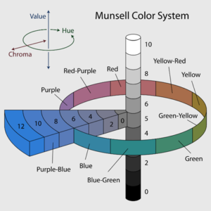
Munsell Color System - by Wikipedia
Chroma is the quality of color overall; it describes the strength of your color. The higher the chroma value, the more pure/better your color is. The LCH model is based on the Munsell Color System which was invented by Albert H. Munsell in the first decade of the 20th century. The model tells you the Lightness, Chroma and Hue in the color model.
In this model you can find the perfect spot for the purest ink color you can get. Some RIP software automatically selects the highest chroma value for your color, but if yours doesn’t, there’s always a way to manually find the optimal chroma value. In a lot of cases you will see that a chroma value of ink goes up, peaks at a certain value, and then goes down again. So for example; you have a chroma value 60.5 on 75% of ink, but you have almost the same or a slightly higher value on 100%. It's better to limit your ink at 75% because you save a huge amount of ink and there’s no difference visible for the human eye. Look at the table below, this is an example how the color (chroma) value looks compared to density. It also tells you that when you limit this color on the density method you will print too much ink without getting better color - this results in printing issues, drying issues etc.

So based on this table, what percentage of ink do you use for Cyan? If you said 75%, you’re exactly right! That’s because the C value peaks at 75% and decreases as more cyan is used.
Last but not least, we also need to set a value for Black. Because this is not a color, the value comes from the L axis (Lightness/Luminance). Here you want to choose the lowest L* value because that is your darkest spot. The lower the L value the deeper your black will be!
Light ink
The most common question I get from customers when consulting on color management regarding light inks is: how much does it improve the gamut, and can my printer produce better and more vibrant colors? The simple answer is: it doesn’t improve your gamut, and you can’t print more vibrant colors with the use of light inks. Light inks are just a part of the dark ink. ( e.g Cyan/Light Cyan)
The added value of light ink has nothing to do with color and color spaces but all has to do with the quality of your print. You can print in finer detail, transitions are smoother etc.
But how do we set these light inks and how do we create the perfect transition from light to dark ink? You measure the Ink Restriction swatch (with light inks included of course) from the RIP software. In some occasions, the dark and light inks are separate swatches you need to print, but the RIP software will tell you in the profiling process when you select the correct ink set of your printer.
After measuring both the dark and light colors of your printer the software automatically shows you the values and the curves. It’s really important to understand what light ink is doing and where you can save ink and get better results. This process is different per printer, ink, etc., and always needs verification prints in order to check the quality.

What you see on the screenshot is the transition between Cyan and Light Cyan on a UV ink machine. The optimal way of setting your ink amount (Y – axis ) is the point where the light ink is dark enough to be taken over by the dark color. On a lot of occasions, you save dark ink for the first 25% of your color by printing light ink (which gives you better quality in lighter colors) and slowly let the dark ink take over light ink. It also means that we don’t need the full 100% of light ink because as you already know; light ink is just a part of the dark ink. The maximum amount of light ink will never be at 100% dark ink. As I already mentioned, this all fully depends on your printing machine, but keep in mind that you can save a huge amount of ink by only setting your light/dark ink transitions the right way. It saves you money, avoids problems in the later stage of profiling, and brings you an even better result in the end!
I always check the transitions of my inks with the default test prints most of the RIP manufacturers implemented - like the one below.
When setting the wrong transition it always shows an issue in the gradient.

As for many things related to profiling and printing; the more you do this process the better you get at it. Understanding different printing technologies and inks and how to implement this will also get easier if you practice this over and over again in different situations. A printer with light inks can also have a positive effect on the settings in your ICC profiles, but that’s maybe one for later!

Teunis has been working at Color Concepts for more than 16 years. He learned profiling at a young age and developed this in different positions as a consultant, profile engineer, and technical manager at Color Concepts. To this day, he travels the world to help print shops solve complicated color issues and create outstanding profiles.
Read more articles
Announcing the Fujifilm Acuity Prime Hybrid Launching Materials Program – ColorBase is proud to play a part!
The Launching Materials Program – What Is It? Fujifilm and ColorBase are collaborating on the Fujifilm Acuity Prime Hybrid…

Dissecting Delta E and the Mathematical Difference Between Colors
When discussing colors, we often don’t need to see two hues or color family types next to each other…

ColorBase Announces Participation in Color Quality Conference ’24
Capelle aan den IJssel, The Netherlands – 22 January, 2024 ColorBase is thrilled to announce its participation in the…