
The Importance of a Custom Test Image for Color Verification
May 3, 2022 by Shelby Sapusek

Have you ever taken a picture with your phone and looked at it later to realize that it was a great image? This might surprise you; but that picture just might make a great custom test image for color verification in your facility.
Your Brain’s Color Memory
Without even realizing it, your mind engages in color memory on a daily basis. That is why some corporations copyright their brand colors.
We can picture Coca-Cola red and Home Depot orange in our heads without actually seeing the colors. We know the color of the McDonald’s arches and Facebook’s background without even thinking about it.
In fact, some companies have been relying on color memory for brand recognition more than logos. A few years ago, our company tested this theory out for ourselves.
My business partner and I conducted an informal two-question survey with some clients and colleagues just for fun. But it turned out to be enlightening.
Over the course of a few months – both online and in person, we asked them two questions. The first question was: “What is the color of the Starbucks logo?” Overwhelmingly, they all answered green or dark green. But then we asked the second question: “What is the Starbucks logo?” Less than half of the respondents knew that the Starbucks logo was a mermaid.

Our conclusion was that color is a strong component in our brain’s ability to remember. And that’s why creating your own custom test print can work for color verification.
Our Custom Print Came By Chance
We were attending the SEMA show in Las Vegas. It was a warm, sunny day in October. Like usual, some of the exhibits were inside the convention center while others were outside in the parking lot.
After spending the morning indoors, we made our way out to the lot where many more cars were on display. It was there that we found the Carroll Shelby exhibit.
On a whim, I posed for a picture between two Shelbys. (If you missed the byline of this article, my first name is Shelby and my namesake is Carroll Shelby.)
My business partner simply took the photo with his iPhone. We thought it would make a funny post on social media. But later after looking at it closely, that image became much more.

I was wearing an orange dress and was a bit sunburnt from the day before. I was in between two blue and white cars, which had great contrast. The flooring was red and gray. Behind me was a truck trailer that featured shades of gray and multi-colored cars. Beyond that, the sky was a bright blue with barely a cloud.
What we had was a single image that included many of the colors that can be hard to hit: reds and oranges, bright blues, skin tone and gray balance. Even better – since we were there that day and we were the ones who took the picture, we knew how that image was supposed to look.
Our custom test image, “Shelby Cubed,” was born.
How To Choose and Create A Custom Test Image
While we discovered our custom test image by chance, we realized that it had the color elements that were important to us. So how do you choose your own unique image?
Start by determining what is important to your color quality and/or your problem areas. Then figure out how to include them in your image.
Then, you might want to add something to the image to make it even more useful. For instance, we added our company logo, which has black lettering, to the left hand bottom corner of Shelby Cubed where the image was dark gray.
Then we added a note above the logo in white that reads, “If ColorCasters below (in black) is hard to see, you may have a gamut compression issue.” Now every time the image is printed, we can tell right away if we have a compressed gamut.
Another addition to your custom test image could be a target to measure. A popular target is three-row ISO 12647-7. By adding a target like this one, you can measure data into a color verification software program and verify the results.

Once you create your custom test image and have a print that meets your color quality standards, keep a copy of it in a drawer and away from light. That way, you can refer back to it when your color starts to drift.
Custom test images are a great addition to your color management strategy and can help keep your quality in check.

Shelby Sapusek started in the newspaper industry; working in graphic design and pre-press. She’s been working in the wide-format print industry since 2011. Today, she travels to printing facilities to work with graphic designers, end users and manufacturers to improve their color management skills.
Title: Color Management Consultant, CMO of ColorCasters, LLC
Read more articles
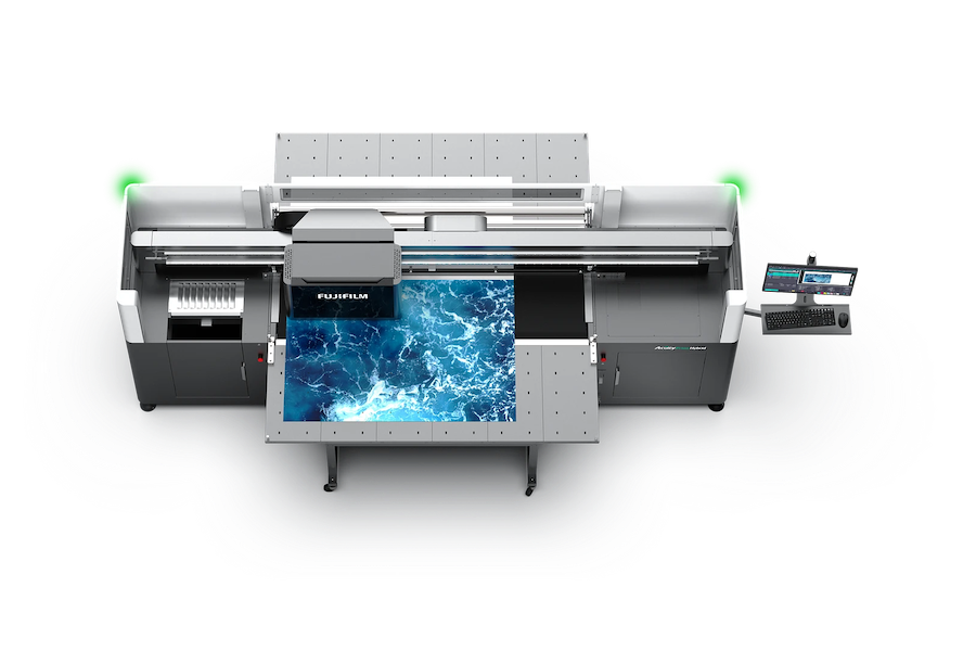
Announcing the Fujifilm Acuity Prime Hybrid Launching Materials Program – ColorBase is proud to play a part!
The Launching Materials Program – What Is It? Fujifilm and ColorBase are collaborating on the Fujifilm Acuity Prime Hybrid…
Dissecting Delta E and the Mathematical Difference Between Colors
When discussing colors, we often don’t need to see two hues or color family types next to each other…
ColorBase Announces Participation in Color Quality Conference ’24
Capelle aan den IJssel, The Netherlands – 22 January, 2024 ColorBase is thrilled to announce its participation in the…