
Seeing Production Inkjet in Color: Why Print Providers Should Adopt Color Management Solutions
March 3, 2022 by Jan Lemieux

Picture this: you are walking through your favorite grocery store looking for your favorite brand of soda. You arrive at an array of bright red bottles, but some look a tad darker in color or less vibrant than the sought-after brand’s notable fire-truck red. Would you feel put off by the inconsistency on the shelf? Would it cause you to second-guess purchasing the product? You might feel enough of a sense of confusion about the label of a well-known brand to make you question if the product is coming from the correct source.
Print providers have a duty to provide high-quality, perfect accuracy every time a print comes off their press. As technology has improved software and hardware offerings, there is more variety of solutions that print providers can access than ever before. Print providers have always looked for easy color management solutions, but now there is technology to help improve high-accuracy output as well.
When it comes down to it, printing is manufacturing. If we think about manufacturing items like vehicle parts or garbage bags, it’s always about productivity: getting that unit out for the lowest possible price, at the highest possible speed, and with the best possible quality results. Color management is foundational to the print “manufacturing” process. At the end of the day, color management ties the different print processes together to deliver the final product.
With advancements in technology and capabilities, print providers are revisiting that need and thinking retrospectively about their manual workflow — looking to leverage technology in ways that they couldn’t before. From a digital front end (DFE) perspective, it is much more advanced now; leveraging automated capabilities for things like spot color matching, calibration, or running routines to check G7 compliance, is a significant topic for the printing industry.
Production Inkjet Then and Now
On the production inkjet side, there are now integrated technologies that take what were manual processes five years ago and embed that functionality into the DFE or into the controller, to improve efficiencies and support the color-managed manufactured process. Color management systems are now smarter, making better-automated decisions through technology. There are also great advancements being made in workflow offerings to support these systems. For instance, Canon’s PRISMAprepare, PRISMAproduction, and PRISMAsync workflow systems have been enhanced to assist in making automated manufacturing decisions
To put it into further perspective, data streams may receive instructions for colors that don’t produce the output wanted. Print providers can leverage more “smart” technology to identify those colors and fix them in real-time, whereas ten years ago they would have required a manual fix upstream.
Another aspect to consider for print providers is the difference between toner versus inkjet. With inkjet, we mix colors kind of like how food coloring mixes — managing color via a liquid carrier. Paper can only support so much liquid. Think about a paper towel; it can absorb a certain amount of liquid, but if it is too much, the paper towel will become completely wet. The same thing can happen with inkjet technology if the ink loads are not managed appropriately. Traditionally it was a very complicated task that required a lot of special knowledge. We’ve taken that experience and developed a tool specific for the Canon production inkjet platform. It takes a lot of those old manual decision points and brings them into a tool that is much easier and quicker to use and gives better results.
Finally, we have solutions to trend color over time. Once the workflow is properly color-managed, it must remain color-managed over time. Solutions such as Maxwell from Chromix can track and trend color and other variables such as temperature and humidity, color drift, and color heat maps to keep the print provider informed on the health of their color-managed ecosystem. It is one thing to make the color right once; it’s quite another to have confidence it’s right every time, all the time.
Attention to Detail
 Some of the challenges for a print provider, whether a commercial print shop or in-house printing facility, is that while the output is a manufactured product, the input — the decisions on what kind of paper, what kind of quality and what kind of application and data streams — are all customized. Printing is unique in that we manufacture a product at the highest possible speed, with the best quality and the lowest cost, using custom, one-off widgets every day. Each widget could be different from every other, each job can be different from every other, and as a print provider, I’d want to know how to do every job in the most efficient way. The way we do it efficiently is to leverage technologies, whether in the RIP, the DFE, the workflow, and/or the color management products. We must leverage this automation to be viable in the print space we’re in to be competitive, to create a customized product using a manufacturing process.
For example, when manufacturing a specific part for a car, the exact same unit is being reproduced every single day. Now imagine that every single day, every single order is a completely different part for a completely different car with a completely different configuration and completely different requirements. That’s the printing industry, especially when we look at commercial print, print-for-pay, and even in-house print providers. They are being asked to print more types of items that are different than, say, just producing statements every month. Print providers must be smart and think about how to leverage all the available solutions to automate the manufacturing process, but with the flexibility to produce different print products at the highest possible speeds with the best quality and lowest price.
In transactional printing, there used to be a concept called transactional color: the idea that we could put down, for example, red for text to highlight something, and it was okay if the red was a little orange one day and a little pinker the next day. There was little concern for color management. However, today’s reality is quite different. On that same transactional document, there is likely a logo, whether that’s the logo of an insurance company, a bank, or a credit card company. Suddenly, we go from color management not being important to color management being critical. If we think that color logo differences don’t matter on a transactional document, just talk to the brand identity department of that company, and they will say the color of their logo is critical to that piece and to their business and their brand identity.
Reality of Color Perception
How do we perceive color? Everything about printing is 100% a result of the lighting environment we are in.
For example, if I want to make sure I have the best possible color reproduction, I need to be in a lighting environment that has the full spectrum of light. A color viewing booth or a lightbox provides a full spectrum of visible light according to ISO specifications. If I’m looking at a printed piece for a specific color, the reason I see that color is the paper reflects and the ink absorbs certain wavelengths of light. The resulting mix of these two interactions reflects to our eyes what we perceive as color. The effectiveness of this visible light is heavily influenced by the lighting environment we are in. If I’m looking at a printed piece for a specific color red, and I’m in a lighting environment that does not include that spectrum of red light, I will not see it correctly on the printed piece.
This is why it is crucial to teach customers how to view and describe color. They must have proper lighting. One way to do that is to go outside, since normal daylight is technically really close to what a light booth gives us. We must have that full spectrum of light. If we don’t, and we are missing part of the spectrum of light, we will miss that color in the printed sheet.
I like to look to the food industry. When we go to our favorite supermarket and we want to buy fresh fruit, the supermarket controls the lighting in that area very carefully so that the fruit and vegetables look appealing. The colors are vibrant and the fruit therefore looks very healthy. Same thing if we go into the meat department and we want to purchase a steak; they control the lighting there so that it looks red and appealing. What happens when we bring it home? The color of the meat may not look as red and vibrant as when we picked it up from the store. If the lighting environment in the store was the same as the lighting environment in our kitchen, we probably would not buy those products as they would look dull and lifeless. Light is critical. We cannot have a color managed system, and we certainly cannot start talking about color, if we don’t have the proper lighting. It’s not pivotal; it’s mandatory.
Color Management Matters
When it comes to color management systems, it is imperative for print providers to be equipped with the proper hardware and software to ensure consistency of output. Color consistency speaks to both a print provider’s professionalism and brand reliability, and inconsistent or mismatched colors can inherently damage a brand’s reputation. Color management communicates to your clients that you pay attention to detail and quality. As a result, customers will be much more comfortable trusting you with their business.
Source: Printing Impressions
ColorBase.com has more than 1,200 Canon print profiles in its library - completely free to download. Head over to the Profile Search Tool to get started!

Jan Lemieux is a manager of Pre-Sales Solutions Support for the Production Print Solutions group at Canon Solutions America.
Read more articles
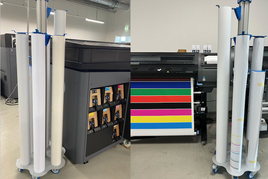
Rolling With It: How the Stock and Roll is Changing How We Work
The Challenge In recent months, the ColorBase Expert Center has been busier than ever. This time of year is…
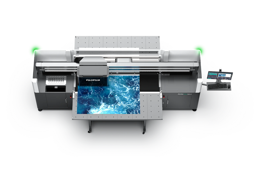
Announcing the Fujifilm Acuity Prime Hybrid Launching Materials Program – ColorBase is proud to play a part!
The Launching Materials Program – What Is It? Fujifilm and ColorBase are collaborating on the Fujifilm Acuity Prime Hybrid…
Dissecting Delta E and the Mathematical Difference Between Colors
When discussing colors, we often don’t need to see two hues or color family types next to each other…