Rendering Intents – A Deep Dive
May 10, 2022 by Marco Roos

Anyone who has printed a picture knows that what you see on your computer or cellphone screen almost always looks very different in the final print. With family photo, we often shrug our shoulders and accept this as inevitable - after all, the moment the picture captures is often more important than what it looks like, right?
However, the story is ENTIRELY different when printing is your business and the color you print is part of the branding of your customer. Similarly, both professional and amateur photographers are constantly striving for better quality and more accurate color in their photos. Simply put, outside of your family photo albums, color becomes critical.
In this episode, we dive deeper into the mechanics behind digital color conversion and will explain rendering intents - the 'black magic' at the core of this process.
Every imaging device is different
Let’s stick to the example of printing a picture. Pictures nowadays are captured by digital cameras, and cameras use imaging sensors. These sensors capture light and turn it into digital information. Light consists of three color components: red, green, and blue, and we shorten this to RGB. That is why color scientists and color management professionals call cameras “RGB devices”. Files coming out of a digital camera are called “RGB files” for that exact reason. Your computer screen consists of millions of light-emitting elements which create the colors and images we see and for that reason, a computer screen is also an RGB device.
And this is where the challenge starts: cameras and computer screens are different devices and the red, green, or blue of a digital camera might look different from the red, green, and blue of a computer screen. Imagine a wall of televisions at your local store: they all show the same image or movie, but all look slightly different. Different components, settings, price levels, and technologies mean that those different RGB devices all have a different color gamut.
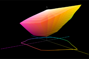
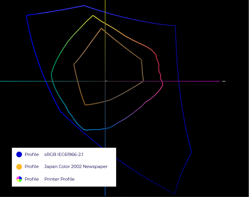
What's a color gamut you ask? A color gamut, or color space, is the total range of colors that can be reproduced (or in the case of a camera, captured) by a device. When using multiple color devices (cameras, screens, printers etc) converting color information between these different gamuts is - needless to say - not always seamless.
How conversion between devices works
This is the reason we need conversion and it is also the reason we need to find a way to describe what a certain device is capable of producing, or which colors it captures. Luckily there is a standard that has been adopted by all major players in the computer industry. It is called an ICC profile and it helps computers understand what color is and what a certain device is capable of. These ICC profiles are attached to image files in the background of your operating system, or stored in the computer applications you use. When you open an image, the ICC file attached to it is used to read the RGB values in the file and translate them into digital colors (also known as LAB values).
Your computer screen also has an ICC profile attached to it, not physically but digitally in the operating system of your computer. The color management system in Windows or macOS uses both of these profiles to convert the RGB values in the files to RGB values for your screen, with the goal to reproduce the colors. This could result in different RGB values since red on your screen might be different from red in your camera.
Doing the impossible
This conversion is easy when you are converting from a small color space to a large color space, as all colors can be reproduced and nothing will be lost. It becomes a challenge when the color space of the file is very different from the screen, or the printer. In reality that is what happens with almost every digital camera to printer conversion: most cameras capture so many colors that only 50% of them can be reproduced by a normal color printer. Also: using a different material or paper will have an immediate effect on the number of colors you are able to print. Imagine the difference between printing on high-glossy photo paper and toilet paper: the latter is designed to absorb, which results in images with very low saturation.
In color management, we use so-called “rendering intents” to convert from one color space to another. Rendering intents are not optional, meaning that they are always applied, whether you are aware of them or not. Think of them as a strategy on how to deal with colors. Their effect is most noticeable when you are converting from a large to a small color space, because that is when you are in trouble, 99% of the time. It is almost like someone that tells you “alright, this is an impossible color, what do you want me to do with it?”.
The different rendering intents
Rendering intents are mathematical methods of mapping colors from one color space to another. Both colors that are in gamut and out of gamut are being mapped. The rendering intent has a direct influence on how this is done. There are 4 official (read: ISO standardized) rendering intents defined, which we'll go through one by one.
1. Perceptual (or photographic) rendering intent
This method preserves a relative distance between all colors in a file when being mapped from one color space to another. The best analogy to explain how this rendering intent works is to imagine squeezing a large balloon into a smaller glass box, by letting air out of the balloon. The entire balloon changes, the shape stays the same but just becomes smaller, but it is still recognizable as a balloon. This applies to colors too, resulting in a picture that might look darker/brighter/different than the original, but still has all the correct color transitions and details in dark areas. Hence the alternative naming “photographic”.

2. Relative colorimetric rendering intent
This method leaves all colors from the input color space that are fitting into the output color space unchanged. They are exactly reproduced and don’t shift and change. However, all colors that are out of gamut will be placed on the edge of what is possible. This often results in a loss of detail in dark or oversaturated areas. Think of a picture of a car with dark tires with a clearly visible tire profile. Converting this image into a much smaller color space with the relative colorimetric rendering intent will result in a loss of all detail in the tires, resulting in a dark area without any visible details. This is the most used rendering for vector CMYK files because they often contain logos and corporate colors that need to be reproduced as accurately as possible.

3. Absolute colorimetric rendering intent
This rendering intent does all the same things as the relative colorimetric rendering intent, except for one big difference: it simulates the white point of the input profile. Imagine using an ISO Coated FOGRA input profile. This profile describes a standardized offset printing press, using FOGRA certified CMYK inks, printing on a standardized coated paper. This paper has a particular color and as we all know: white is not just white. The white point tag in a profile describes this white in LAB values. When using the absolute colorimetric rendering intent, the color engine will also convert the white point and will try to simulate it on the printer or display. This rendering intent is used for proofing applications, where an inkjet printer or computer screen is used to predict the output of a production printer. It also works well when trying to mimic the color of a printed sample. The reason is that most inkjet inks are semi-transparent, which makes the color of the paper affect the color you are viewing.

4. Saturation rendering intent
The final rendering intent aims to maximize the use of the output color gamut. This means that each color from the input color space will get converted into the most saturated color possible. This results in bright and saturated colors, but accuracy is often totally lost. This rendering intent is rarely used in production workflows but might come in handy when trying to achieve the impossible in case a requested color is out of gamut. You might get lucky!

There is also an add-on setting for both the relative and absolute colorimetric rendering intent, called: “Black point compensation”. This setting applies a compression to dark colors that are out of gamut. It basically works like a perceptual rendering intent within a relative or absolute colorimetric rendering intent, but only for darker colors. When a RIP or color manipulation software, such as Photoshop, supports this mechanism, the best results are often achieved by using a relative colorimetric rendering intent with black point compensation. It solves the issues of the details in dark colors disappearing and maintains all colors that are in gamut.
How to apply this knowledge?
This is a lot of information to take in and it is also quite abstract. The best way to familiarize yourself with it is to try it out. Photoshop allows you to convert colors with a preview, which shows you on-screen what happens. Try something extreme, for the best results. Photoshop comes with a standard ICC profile for Japanese Newspaper presses, this profile has a small gamut and it effectively shows what happens when you convert from a colorful RGB picture to a newspaper printing press gamut. The differences are huge and the effects of changing the rendering intents are immediately visible. Also, the use of the black point compensation can be simulated on-screen. Like with everything else in color management: trying and playing around is often the best way to develop a feel!
Rendering intents and printing workflows
The next step for every printing company is to use this new insight and apply it to your daily practice: the printing workflow. We learned here that selecting the correct rendering intent can make a huge difference in output. Picking the correct one is not only important to get the maximum out of your printers, but also to make sure you are able to produce repeatable quality over time. In general, a relative colorimetric rendering intent in combination with black point compensation gives the best results for most printers and materials. Most RIP software will support black point compensation by now, and you can typically find it in the ICC color settings. In case you cannot find it, contact your supplier and make sure you are using the latest version.
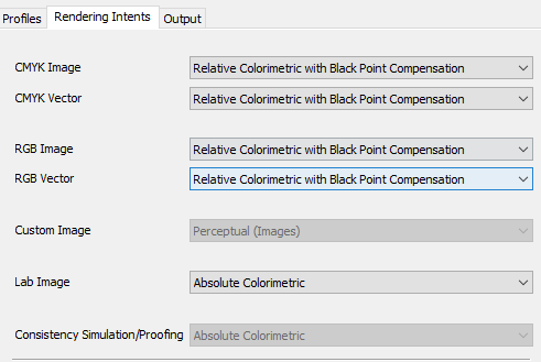
The best result for a consistent print workflow is rarely the absolute maximum color saturation, which you could try to achieve with a saturation rendering intent, but rather a consistent and achievable result, which you are able to reproduce at any given moment in time.
There is nothing magical about digital colors, since it is based upon mathematics, although we believe that color still works magic in our daily lives!
Feel free to contact us if you want to know more about color management, managing workflows, and getting your printers set up for maximum performance! If you enjoyed this article, check out our previous Deep Dive into Printer Profiles, and our tutorial on how to Set Ink Restrictions Like a Pro!
Set Ink Restrictions Like A Pro
One of the first and most important steps in creating profiles on a ‘halftone’ printer is setting the correct Ink Restrictions. In this blog post, I want to tell you how – and why! – to set your Ink Restrictions like a pro. Before we dive into this, it’s important to know that most RIP…
Printer Profiles – A Deep Dive
Printer profiles are a seemingly daunting and complex topic – they have been discussed and dissected millions of times, and yet, what they are what they do still confuses people across our industry. The reality is that printer profiles are a lot less mysterious than most people think, and every print shop in the world…
Read more articles
We’d love to know MORE about how you address issues with color
The response to our last survey was incredibly helpful – here’s a few follow-up questions that will further help…
We’d love to know how you address issues with color
In order to design better color solutions for you, we’d appreciate your input to the following questions. Thanks!
3 Reasons Why You Should Have a Spectrophotometer
This article was previously published on aldertech.com If you’re a designer, printer, or photographer, you’ve probably heard of…
