AI, Image Creation and Color – Quality Output or a Color Conundrum?
September 12, 2024 by Shelby Sapusek

It would be difficult to find someone who hasn’t heard of artificial intelligence (AI) these days. And every day, more and more people are using AI.
On the word side, it’s being used to write short stories or to spruce up resumes and cover letters. On the art side, it’s being used to edit photos or create new images and videos.
Some AI capabilities have been added to apps and programs we use every day, such as Microsoft Word, Gmail and Adobe PhotoShop. But more and more standalone AI solutions – especially for image generation – are debuting all the time.
The Controversies Surrounding AI
The growing technology of AI is certainly interesting and at times captivating. But it’s also created some concerns and controversies.
In the general public, it’s brought about mistrust. How can we be sure the images and videos we are seeing on social media platforms or even news sites are real and not AI driven?
In trades, some authors and designers are hesitant to embrace AI. Its seeming ability to allow almost anyone to write a novel or design its book cover isn’t appealing to traditionalists. In a way, they believe that AI takes away from their talent and creativity that they have cultivated and there’s a growing fear that AI could someday replace their jobs.
In the print industry, a different set of issues have emerged. For instance, to print many of these images, a plugin or add-on must be purchased so that the file can be downloaded at a higher resolution.
But another consideration when dealing with AI images is color.
The Color Conundrum Surrounding AI
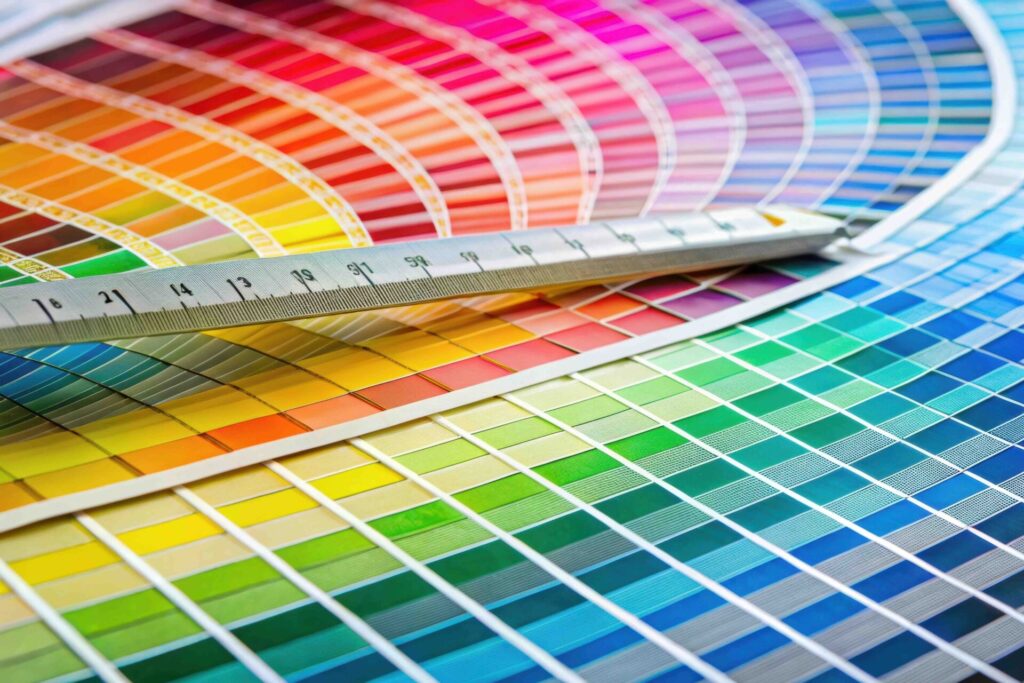
As a color management consultant, we tell clients and workshop attendees that color should not be described with words. It’s ineffective to tell a printer that we need a color to be warmer or redder or bolder. The color of green grass for one person is different to another due to color memory. So instead of words, we use numerical values to describe color.
Yet when we use AI creators, we use prompts, which are word commands, to generate images and, yes - colors.
Over the past year, I’ve been experimenting a little with AI using Midjourney. It works like many AI generators do. In my basic creation, I start with a prompt of “/imagine” and I add a series of words and phrases to try to describe what I want Midjourney to create. I am given four options of Midjourney’s interpretation of my prompt. I can then choose one of the four and add more words or phrases to create more iterations or I can start over with a brand-new prompt. I can even try repeating the same prompt because Midjourney will never produce the same images even if I use the same words.
When creating images, sometimes the results are close to what I imagined and other times they are far from it. But I’ve had some success creating artwork to illustrate workshop topics in slide decks. For example, I created a colorful clock to accompany a slide detailing our workshop agenda and an illustration for eye frailties. (see images)

")
My experience so far with color creation and AI has been less successful, but I’m still learning.
I’ve had to retrain my brain a little bit to think about how to describe color in word prompts. Not unexpectedly, when I simply used the prompt of “green grass,” I received the same amount of variance from Midjourney as I would if I was trying to describe it to people from different regions. (see image)

Basic color theory teaches us that humans generally perceive neutral gray the same, which is why we profile printers to be in gray balance. Once we have a printer in a good known print condition with gray balance, the other colors tend to fall into place.
Based on that theory, I wanted to create an image that portrayed gray balance. I’ve been looking for ways to incorporate AI into our color management work (besides illustrations for workshop slides) so I wondered if I could create a monochrome image in Midjourney that could be used in test prints. While Midjourney returned an image that looked gray, it was of course RGB because of the nature of the software. I could always pull the image into PhotoShop and turn it into a gray image, but I could do that with any image outside of AI too. (see image)

Over the past year, I’ve done some reading about AI and specifically Midjourney since it’s my tool of choice. One resource has been the Midjourney Experience newsletter from my colleague, Marshall Atkinson, and his latest article in Big Picture Magazine is one I’d recommend to those with AI interest. From his words and from other articles I’ve read on the subject, I’ve realized that like any software program, computer or printer, Midjourney has its limitations.
Experimenting With Color In Midjourney
If I’m looking for Midjourney to give me an image containing a certain color, I can’t give it numerical values in RGB or HEX. And it has no idea what Pantone colors are. I’ve tried.
I picked a well-known Pantone 185 and simply entered that in the prompt to Midjourney. It was clear from the resulting image options (a flamingo, a series of chairs, some random artwork) that Midjourney couldn’t comprehend what exactly Pantone 185 was. (see image)

But what if I could be more clear with my words to describe it?
You can easily find out numerical values for Pantone 185 in CMYK, RGB, L*a*b* and HEX. And if you use an online color identifier tool such as ImageColorPicker.com, you can find out the common color name for Pantone 185.
I used its HEX number #EB002A and entered it into ImageColorPicker to find out that the common color name for Pantone 185 is Torch Red. (see image)

I returned to Midjourney and entered the prompt of “woman in red dress in a restaurant. use color torch red” and it resulted in an image with a much closer color to Pantone 185. I was able to verify its closeness – but not exactness – by opening up the image in PhotoShop and using the color picker to verify the red. (see images)


What I’ve Learned About AI – So Far
AI has come a long way but there is so much that we don’t yet understand about it and more we need to learn about how to effectively speak to it.
When it comes to color creation, the numerical values of colors aren’t helpful except to perhaps identify a common color name that AI can understand as I showed in my experiment.
I have found through trial and error that concentrating on one or two desired colors in an image instead of many colors gets better results. I’ve also found mentioning the colors near the beginning of the prompts garners better results as well.
It is yet to be seen how AI will affect artists, designers and authors or if it will someday replace those jobs or others in our industry. Likewise, it’s unknown how mainstream it will become in the print industry or what its role will be in society overall.
But like all technology, it will likely continue to grow and evolve. It will take time to learn about it and work with it effectively. But it’s of my opinion that AI is here to stay so I plan to continue to give it some of my time and energy going forward.

Shelby Sapusek started in the newspaper industry; working in graphic design and pre-press. She’s been working in the wide-format print industry since 2011. Today, she travels to printing facilities to work with graphic designers, end users and manufacturers to improve their color management skills.
Title: Color Management Consultant, CMO of ColorCasters, LLC
Read more articles

We’d love to know MORE about how you address issues with color
The response to our last survey was incredibly helpful – here’s a few follow-up questions that will further help…
We’d love to know how you address issues with color
In order to design better color solutions for you, we’d appreciate your input to the following questions. Thanks!
3 Reasons Why You Should Have a Spectrophotometer
This article was previously published on aldertech.com If you’re a designer, printer, or photographer, you’ve probably heard of…