Dissecting Delta E and the Mathematical Difference Between Colors
January 22, 2024 by Shelby Sapusek

When discussing colors, we often don’t need to see two hues or color family types next to each other to understand that they are very different from each other. We generally understand that red and green are not the same color; nor are orange and violet.
However, in color science and color management, we need to talk about color mathematically and not just visually. In color management, we are often attempting to discern between two swatches of colors that are so alike that you may not be able to visually see the difference like you can between red and green.
To do this, we need to understand how colors are described mathematically and then use measurement tools to find the numerical difference between them. That numerical difference is called Delta E.
Color is Math: The L*a*b* Color Space
Before we can explain how Delta E works, we have to first understand the L*a*b* color space, which is how colors are defined mathematically. In my ColorBase article “How To Create Named Spot Colors in Adobe (And Your RIP),” I explained that the L*a*b* color space is best understood as a three-dimensional globe.
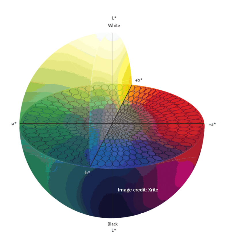
The L axis represents the gray balance with a higher L number trending towards the top of the globe being whiter and brighter while a lower L trends towards the bottom of the globe and is darker and blacker. The a axis is the red to green spectrum with a higher number trending towards red and a lower or negative number trending towards green. On the b axis, we have the yellow and blue spectrum. A higher, positive number on the b axis trends towards yellow while a lower, negative number trends towards blue.
The L axis nominally ranges from 0 to 100 while the a axis and b axis range from -128 to +127. Every color has a number on each of the three axes which lands it in a specific place on the L*a*b* color space globe.
To illustrate, if you open up Adobe PhotoShop and enter 25, 45 and -35 in the L*a*b* boxes in Color Picker, you will see that those spectral numbers designate a purple color with a CMYK value of 74, 100, 22 and 6. (Note: The CMYK values depend upon the CMYK profile you choose in Color Settings for PhotoShop. Read my ColorBase article “How To Set Up Ideal Color Management Settings For Adobe Software” to learn more about profile settings.)
When two L*a*b* color values are measured and compared, the difference between them is called Delta E (also written and understood as dE and ΔE).
Dissecting Delta E
The word “delta” is derived from the Greek and represents the incremental change of a variable. “Delta E” as a whole means a difference in sensation. In color science, Delta E is the measure of change in the visual perception of two colors.
Delta E values range from 0 to 100. When the Delta E between two colors is 0, they are the same color. When it's 100, they are considered opposite colors. A lower Delta E number between two colors means that the colors are closer together on the visual spectrum.
The International Commission on Illumination (commonly referred to as CIE) was formed in the early 1900s. Its purpose was to standardize colorimetry, photometry and imaging. But it wasn’t until 1976 that the organization addressed color differences, which is also when the first formula for Delta E was born.

Later it was determined that Delta E 76 performed poorly when comparing samples that were highly saturated. Since then, as studies in color science progressed, two more algorithms for Delta E have been produced by the CIE.
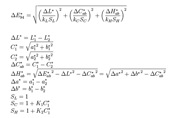
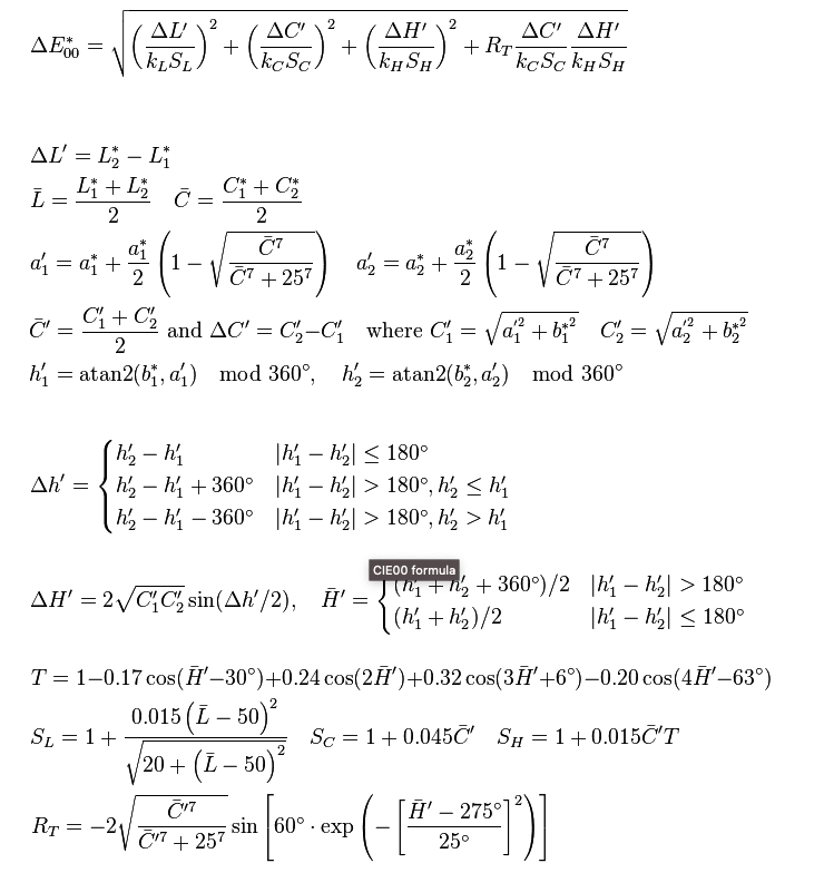
The above was produced 1994 and the latest in the year 2000, shown beneath this paragraph. Both formulas for Delta E became increasingly more complex. In fact, Delta E 2000 can’t be explained in a spreadsheet. Delta E 94 improved by considering the factors for lightness, chroma and hue. It also added a use case modifier of textile or graphic arts. But there were lightness inaccuracies in this formula which were corrected with the Delta E 00 formula.
Using Delta E: What Number Is Best?
In the print industry, we use a combination of spectrophotometers and software to measure colors mathematically and determine Delta E as a comparison. Delta E becomes important when you are attempting to achieve a certain brand color for a client. If you have a contract to produce signage for a professional sports team or for an internationally known soft drink company, you understand that brand colors are extremely important.
By measuring a printed swatch of color and comparing that measurement to one of a known good print sample, we can arrive at a Delta E between the two and determine if we are capable of printing the needed color. If the Delta E number is low, we can ascertain that the printed sample is acceptable.
As color management professionals, we get asked all the time: What is the acceptable number for Delta E?
It’s harder than you might think to answer that question.
First we need to make sure the correct tolerance (algorithm) of Delta E is being used. In the print industry, it is generally recommended that Delta E 00 (2000) is used across all platforms including the RIP, design and color evaluation software systems. That is because Delta E 00 is currently the most accurate algorithm available and it most closely mimics how the human eye sees color.
Another consideration is product placement and adjacency. Once you’ve decided upon an accepted color and the item is produced, where will it end up? Will your creation be on a lone billboard on a highway or on a cardboard carton on a grocery store shelf with presumably other cardboard cartons created with the “same” color? If the finished product will be displayed solo, you can likely be more flexible and forgiving with the Delta E number.
It is said that a human eye that is trained to evaluate color can see a visual difference between two swatches of color that have a Delta E of 2 or 3. The untrained eye may only be able to see a visual difference between two swatches of color that have a Delta E of 5 or 6. (Remember, a lower Delta E means the two colors are closer together on the visual spectrum.)
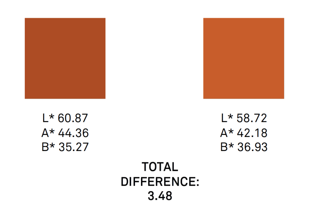
So there really is no answer to the question of an acceptable Delta E number. The answer depends on the tolerance, product placement, the humans involved and the very color itself.
However, having an overall understanding of the math behind the color science, L*a*b*, and Delta E will inevitably aid you in your journey to achieve accurate, precise and repeatable color in your print process.
Read more articles
We’d love to know MORE about how you address issues with color
The response to our last survey was incredibly helpful – here’s a few follow-up questions that will further help…
We’d love to know how you address issues with color
In order to design better color solutions for you, we’d appreciate your input to the following questions. Thanks!
3 Reasons Why You Should Have a Spectrophotometer
This article was previously published on aldertech.com If you’re a designer, printer, or photographer, you’ve probably heard of…


