Keeping It Neutral: Creating the Ideal Workspace to View Color
February 28, 2023 by Shelby Sapusek
How we view and assess color is important throughout a color management strategy. While we can’t solely trust our eyes alone, there are steps we can take that make it easier and better for our eyes to see color.
The Problem with Our Eyes
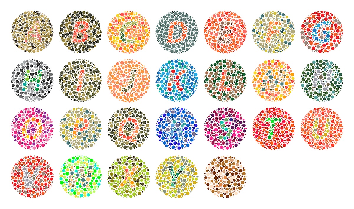
Human eyes are frail. They become less effective with age. We don’t see as well at night as we do in daylight. Our eyes get fatigued after being used for several hours. Stress can cause us to see color differently. Other physical ailments, such as color blindness, can obviously affect the way we see color as well.
That isn’t to say that we should disregard our eyes completely when it comes to judging color. We just can’t depend on them solely. We need to pair how we see through our naked eyes with measurement devices and verification software.
Another way we can help our eyes is to control our viewing environment and create the ideal workspace to view color. Where are you viewing jobs with critical color? Are you at your personal workspace or in the printing shop area? Wherever it is, there are certain rules you should adhere to when it comes to your viewing environment.
Declutter That Desktop

Desktops and computer tabletops can become messy over time. We also tend to decorate our personal workspaces with pictures of our loved ones and pets as well as other trinkets.
The problem is that photographs and other memorabilia on our desks contain color, which can negatively affect the representation of color on our computer monitors.
How does this happen? Our eyes play tricks on us. Have you ever inadvertently looked at a bright light too long? What happens when you look away? Likely, you see bright yellow or white spots in your line of sight.
The same can happen when our eyes pick up different colors in the background of our line of sight. If there is a brightly colored photograph on our desktop just to the right of our computer monitor, we might not see the colors on the monitor correctly.
Keeping your desktop or computer tabletop free of clutter will help you assess color more accurately on your computer screen.
From the Ceiling to the Walls to the Floor … to You
Once the desktop area is free from color clutter, we need to turn our attention to the rest of our working environment.
Just like colorful photographs on desks can affect how we view color on our computer monitors, the colors of our walls, ceilings and floors can do the same. Ideally, walls and ceilings should be painted a neutral color such as white, gray or beige. Floor tiling or carpeting should be neutral in color as well.
One consideration many people forget about is their clothing. Light can reflect off clothing and affect how we view color as well. It’s best to avoid bright-colored clothing such as reds and blues. Instead, choose darker, neutral colors such as grays and blacks.
It’s All in the Lighting
Now that we’ve neutralized the color in our workspace and in our attire, it’s time to tackle the most important color viewing condition: Lighting.
In your workspace, you want to use the correct ambient lighting. If you’ve ever used a home decorator, you might have heard the term. Ambient lighting is the primary source of light in a room.
Some experts say the correct ambient lighting for a room is D50 or what is called Equal Energy Daylight. If you’re unsure if your working environment has the correct lighting, you can test it using a light condition indicator patch.
An example of a light condition indicator patch can be found in a Pantone color book or you can purchase individual stickers. The indicator has two swatches of color. If, under the workspace’s lighting, the two swatches appear differently, then your ambient lighting is not correct.
Don’t forget to look into lighting tools as well. Every printing facility should have a light booth and some professionals swear by monitor hoods that help to block out overhead and side light.
Staying Neutral
If you’re having trouble with your color-viewing workspace, just remember to keep it neutral. The best way to have a successful color management strategy is to eliminate variables that can affect color quality.
Do you have questions about your workspace or color management in general? Feel free to email me at shelby@colorcasters.com.
Read more articles
The Most Important Checkbox in your RIP Color Management Settings
If you’re serious about color accuracy in your printshop, you’ve likely explored output profiles for your large format printers….
The Future of Large-Format Printing: AI, Sustainability, and Remote Innovation
This article was previously published on printvergence.com At HP we are already looking to the year ahead and all…
What are the complications of ICC RGB profiles?
As content creators, whether you’re a photographer, graphic designer, or digital artist, understanding the role of ICC RGB colour...

