Why Monitor Calibration Is Important For Color Management
July 12, 2022 by Shelby Sapusek

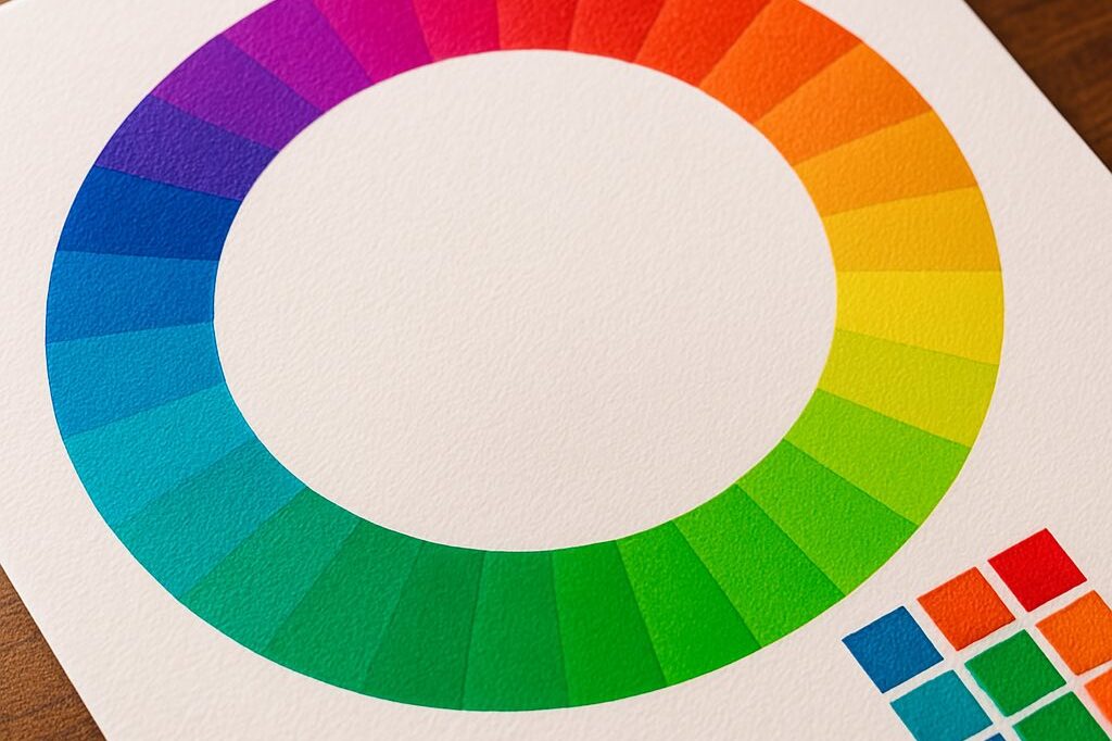
As human beings, we can see millions and millions of colors with our eyes. Of course, we want to be able to recreate all those colors in our prints. But that’s impossible.
While we can see all these colors, our computer monitors can theoretically reproduce about 17 million colors. Beyond that, our printing devices can only reproduce thousands of colors.
That, in essence, is why color management is so important to printing.
Additive vs. Subtractive Color Space
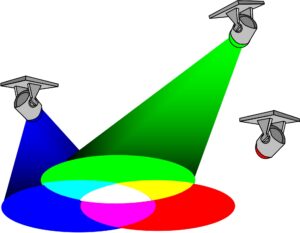
Lights, cameras, monitors, and our eyes all operate in the RGB additive color space.
We see color in the RGB (red, green, blue) additive color space. The same is true for cameras, scanners and our monitors. However, our printers’ output uses the CMYK (cyan, magenta, yellow, black) subtractive color space.
The RGB additive color space is based on white light. When all three colors of red, green and blue overlap, white light is produced.
But what happens if only two of the colors overlap? Imagine you have three flashlights. One shines a red light, another green and the last one blue. If the blue and green lights overlap, a cyan color (C of CMYK) is produced. If green and red overlap, a yellow color (Y) is produced. If red and blue overlap, a magenta color (M) is produced.
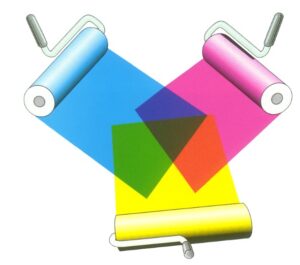
Inks, printers, and paints all operate in a subtractive color space - in this case, CMYK.
Similarly, in the CMYK subtractive color space, if equal portions of cyan, magenta and yellow are overlapped, a black color (K) is produced. This is not a true black so our printers use additional black ink or toner to create a richer black.
It is easy to understand why quality color is so difficult to achieve when our eyes and monitors use the RGB color space while our printers use CMYK.
The Monitor As Your First Line Of Color Quality Defense
When a client sends you a file to print, what’s the first thing you do? You probably open it up on your computer. If your monitor is not calibrated to view color correctly, you won’t be viewing that file as it was meant to be seen.
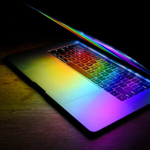
Manufacturers often ship their devices with vibrant screen settings that, while eye-catching, don't reflect real world color.
When you first get a new laptop or monitor, you may notice that the settings for the display are as bright and white as they can be. The manufacturer wants you to see vibrant colors in your display. But that’s not how we really see color and it’s definitely not how we can reproduce color on our CMYK printing devices.
You may think that color should only be adjusted in the printing phase of the process. But the reality is that setting yourself up for color quality success starts in the graphic design / prepress department. And calibrating the monitors in those departments is the first line of defense when it comes to color quality.
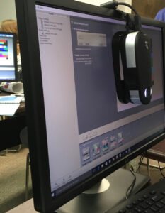
If you have the equipment, calibrating your monitor is quick, easy, and worth the effort. Image Credit: Color Casters LLC
You Can Calibrate Your Monitor For Free!
Well, sort of. If you’re serious about color management and you own an i1 spectrophotometer, you can calibrate your monitor for free.
There is an X-Rite software solution called i1 Profiler that you can use with their i1 spectrophotometer measurement device to calibrate your monitor for no extra charge.
What’s nice about this solution is that it’s wizard driven. You hang the spectrophotometer on the front of your monitor as centered as possible. Then you just follow the steps as instructed by the software.
Understanding The Outcome
I once worked at a facility who asked me to calibrate all the monitors of their graphic designers and photographers. In some cases, I was met with open arms and others with adversity over change in their process.
People get so used to the out-of-the-box bright white monitor display. Once a monitor is calibrated correctly, it might look dull and a bit yellow; but it’s more in line to how we view color with our eyes and how color can be printed.
I have created an original how-to guide that walks you through the monitor calibration steps using an i1 spectrophotometer and the free i1 Profiler software. If you’re interested in learning more and/or would like a copy of the how-to guide, please email me at shelby@colorcasters.com.

Shelby Sapusek started in the newspaper industry; working in graphic design and pre-press. She’s been working in the wide-format print industry since 2011. Today, she travels to printing facilities to work with graphic designers, end users and manufacturers to improve their color management skills.
Title: Color Management Consultant, CMO of ColorCasters, LLC
Read more articles
The Most Important Checkbox in your RIP Color Management Settings
If you’re serious about color accuracy in your printshop, you’ve likely explored output profiles for your large format printers….
The Future of Large-Format Printing: AI, Sustainability, and Remote Innovation
This article was previously published on printvergence.com At HP we are already looking to the year ahead and all…
What are the complications of ICC RGB profiles?
As content creators, whether you’re a photographer, graphic designer, or digital artist, understanding the role of ICC RGB colour...